What are the Different Types of Logos?
The different types of logos include a range of styles. From text-based to image-based, literal to symbolic, static to dynamic, there’s no shortage of successful logo styles.
The types of logos outlined below aren’t meant to be exclusive or definitive—some marks straddle the line or incorporate more than one element.
Whichever logo style you choose for your brand, your decision should be calculated and deliberate—ideally based on brand research and in-depth brand strategy.
Combination Logos
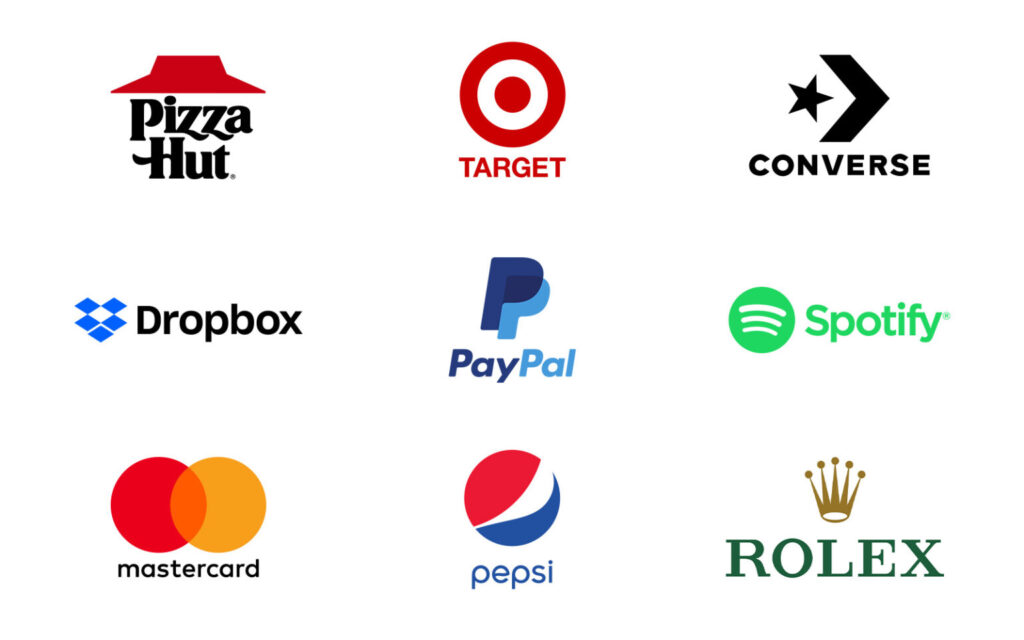
Combination logos incorporate both a wordmark and a symbol. Of all the types of logos, this is the one most people think of when they think of a logo—but that doesn’t mean it’s always the best choice.
The wordmark and symbol in a combination logo can be laid out side-by-side, stacked on top of each other, or integrated together in an image. Because they incorporate both a wordmark and a symbol, combination logos are typically easier to trademark than symbols alone.
Combination logos give you the benefit of immediately associating your brand name with a meaningful symbol. The downside to combination logos is that they can easily become overly complicated, losing the simplicity that is the hallmark of a strong logo.
Wordmark Logos
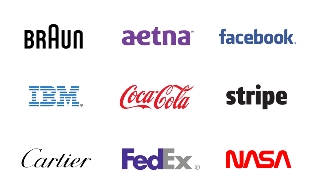
Wordmarks are the literary stalwart in the types of logos. A wordmark comprises a standalone word or words (your brand name), and should be easy to read while featuring a highly distinctive typeface.
In this sense, a wordmark is arguably the simplest form of brand design. It doesn’t rely on symbolism, but rather simply on a meticulous fine-tuning of character dimensions and kerning. That said, wordmarks are sometimes conceptual or pictorial in nature, representing an idea beyond just the name they spell.
Whether you’ve noticed it or not, the FedEx wordmark features an arrow in the whitespace between the final two letters. Deftly suggesting forward movement and progress, the subtlety of the symbol is in fact its most powerful characteristic.
Letterform Logos
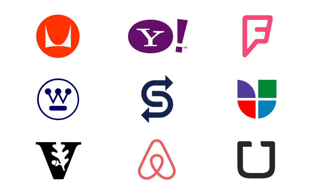
The leaner, more minimalist cousin of the wordmark, letterform logos feature a singular letter to graphically represent a brand. Because they are freestanding and don’t constitute a complete word or message, letterforms must be characterized by bold personality and significance.
Successful letterforms come to automatically and unconsciously evoke the full name of a brand in the mind of consumers. Yahoo’s “Y” and Westinghouse’s “W” are each fine examples of this type of logo.
Advantages of letterforms include their scalability; because they incorporate minimal elements, they can easily be reduced for purposes of app icons, social media, and the like.
Monogram Logos
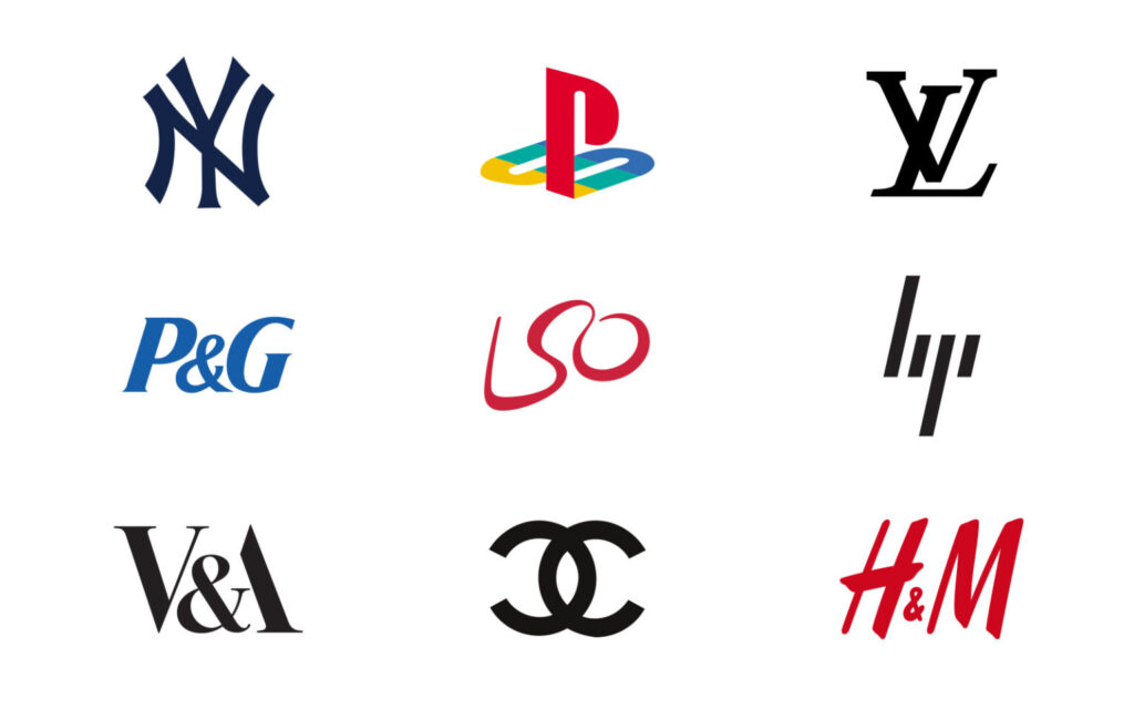
While letterform logos feature a single letter, monogram logos or lettermarks (not to be confused with letterforms) consist of multiple letters, usually the brand’s acronym.
From IBM to HBO to YSL, monograms have long extended the simplicity of an acronymic name to brand identity, with varying levels of sophistication. The downside of a monogram logo is that, while simple, they can sometimes be difficult to read and harder to remember.
Acronymic names are saddled with these challenges to begin with, and incorporating them into a visual identity often only exacerbates the problem. Some of the world’s top brands have obviously made the monogram logo work for them, but we wouldn’t recommend it (or an acronymic name) for a company just starting out.
Abstract Logos
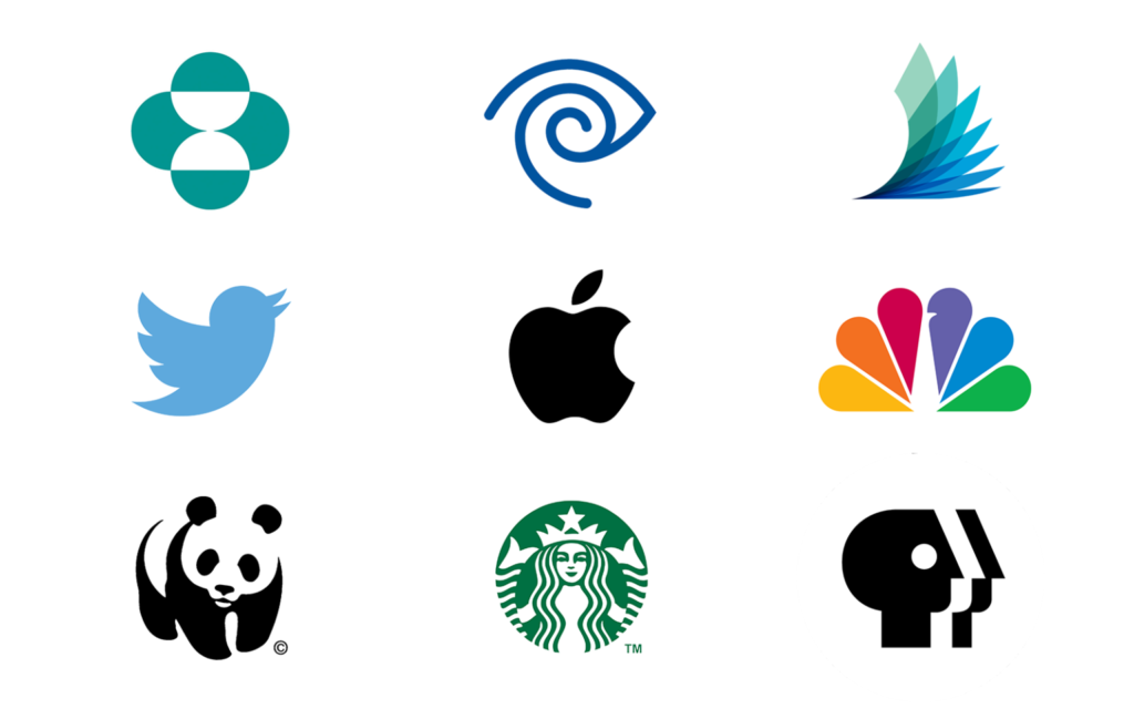
Of all the types of logos, abstract logos draw most on the power of imagery and symbolism to connote the core tenets of the brands they represent.
Whether they feature an easily recognizable pictorial image or a more abstract and ambiguous form, abstract logos should be simple yet significant, and make the most of shading and negative space.
As is often the case in branding, when it comes to abstract logos, the simpler the design the more difficult it is to execute. Because they’re equivocal by nature, abstract logos are particularly effective for multi-divisional, service-based, and technological brands.
Mascot Logos
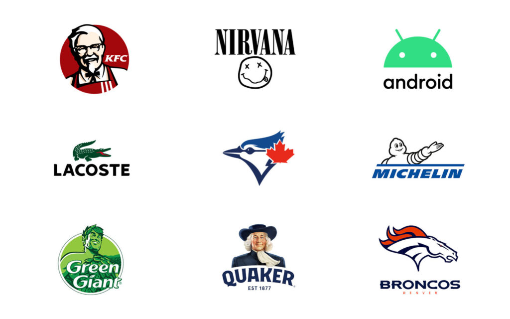
Mascot logos incorporate an illustrated character of some sort—the whimsical figurehead of a brand’s story. From KFC to Pillsbury to Pringles, some of the world’s most successful brands have humanized their products with lovable characters featured front-and-center in their logos.
Mascot logos are great for family-friendly brands looking to appeal to children, but they increasingly feel tied to a bygone era of advertising. For companies looking to imbue any sense of seriousness into their brand, essentially any other of the types of logos should be considered over a mascot logo.
As with all combination logos, mascot logos can easily become overly complicated and often present problems when it comes to scalability.
Emblem Logos
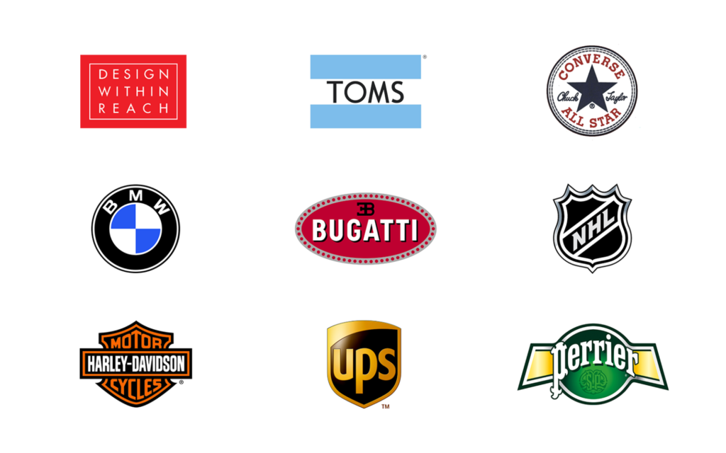
When a wordmark, letterform, or abstract logo is housed within a shape that is an essential part of its identity, it is an emblematic logo.
Emblematic logos often contain multiple elements, but when choosing this route, it’s wise to maintain simplicity as your ultimate goal.
The downside to emblematic logos is scalability. Because the typeface or image of the mark is, by definition, contained within a fixed space, these elements can become illegible as the logo is reduced for purposes of mobile or other small media.
Dynamic Logos
When it comes to branding, the words “online” and “digital” are quickly becoming tautological. There are fewer and fewer instances where your logo is not presented via digital media.
This means that types of logos are no longer constrained by the static nature of print. They can move and morph and even take the form of miniature narratives. Enter the dynamic logo, a mark defined by its changing, digital nature.
When Casa Da Musica, Portugal’s Rem Kohlhaas-designed music center, needed a versatile identity, they turned to Stefan Sagmeister, who developed a dynamic logo inspired by the building’s architectural form and featuring shifting perspectives and customizable color palettes.
Why It’s Important to Choose the Right Type of Logo
Which type of logo to choose might seem like an inconsequential decision. But getting your logo design right is important for many reasons.
As the Harvard Business Review concluded from a study of the most effective logo types, a well-designed logo offers a range of measurable business benefits, including:
- Piquing the interest of new customers
- Differentiating your brand from competitors
- Promoting brand recognition and awareness
- Influencing the decisions of potential investors
- Communicating what your brand is all about
This is why it’s important that your logo be inspired by more than just creative whim. The best logos are born from brand strategy, informed by the sequence of cognition, and be highly differentiated from the competition.
Selecting the right logo type ensures that your logo will evoke your brand personality and embody your brand voice. It puts you in a better position to craft a mark that conveys your brand positioning.
Ultimately your logo should boil down to a single idea. Logos that try to convey multiple concepts are ultimately remembered for none of them.
In short, creating a great logo isn’t easy. A designer has typefaces, colors, and (sometimes) symbols to work with. Using only these basic elements, they must create an original signature that represents profound truths about your brand. Easier said than done.
The Takeaway
Choosing the right type of logo can be a daunting proposition. When you know your brand inside and out, however, the process becomes immeasurably easier.
Once you understand your brand’s personality, positioning, and foundational messaging, the type of logo that will best represent it becomes more of a gut feeling than a guessing game.
This level of comprehensive understanding comes only after thorough brand research and brand strategy. By understanding the massive iceberg that is your brand, you can shape the tip so that it reflects the multifaceted breadth below the surface.
Source: ignytebrands